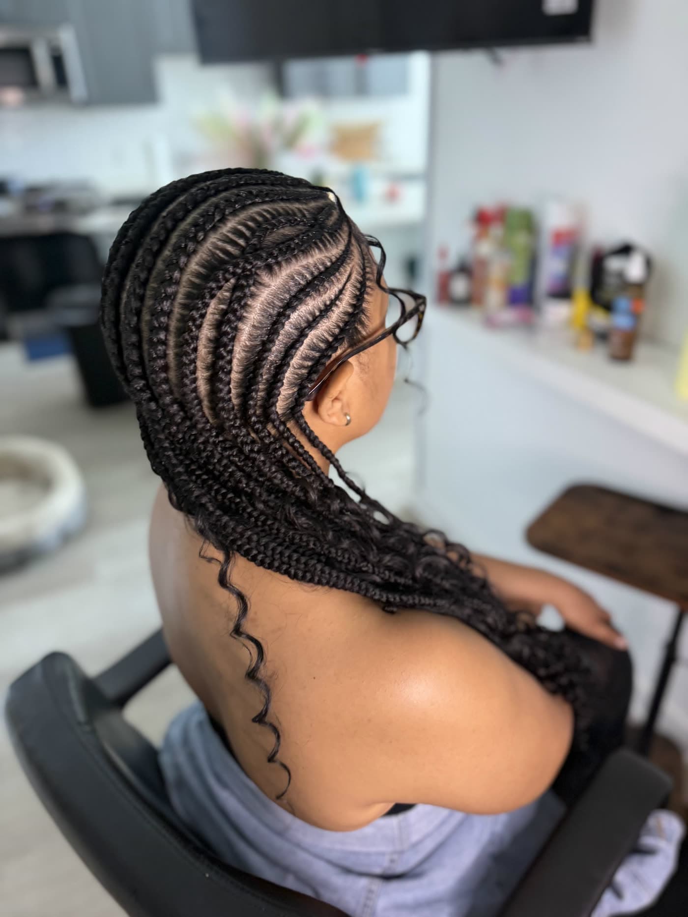
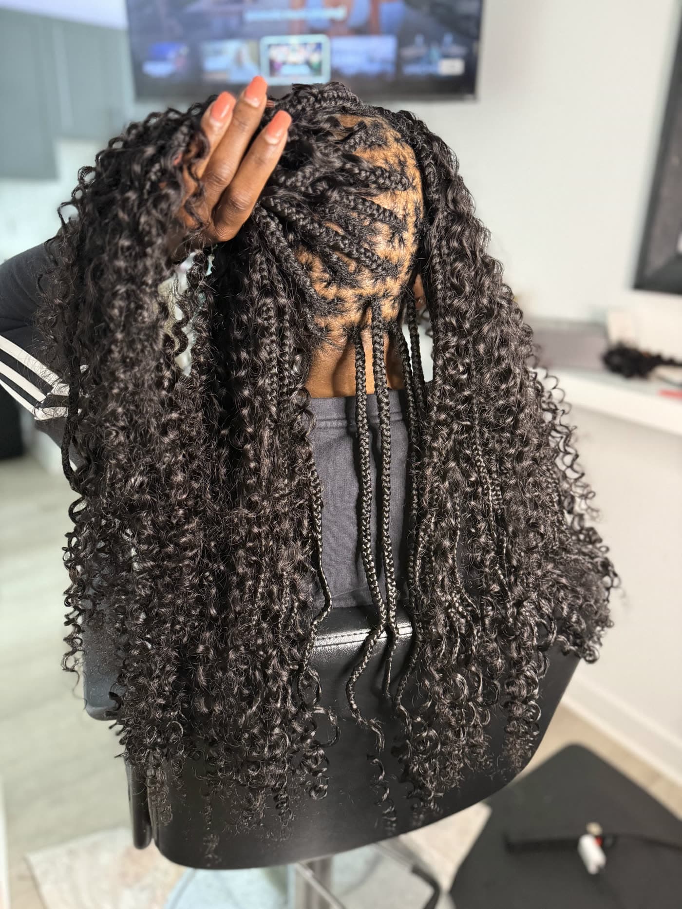
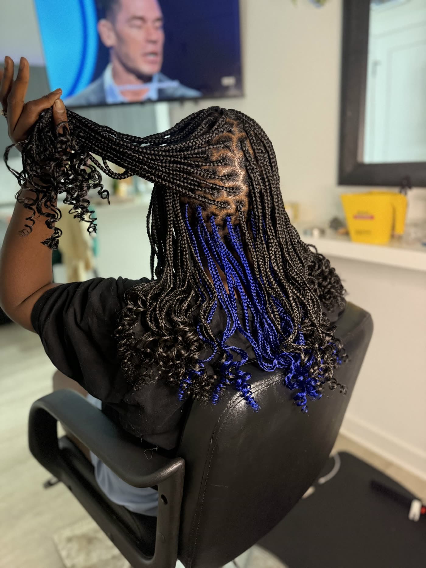
Do I bring my own hair, or do you provide it?
I provide all the hair, and it's already in the price — you don't need to buy a thing or guess at how many packs to grab. If you want a specific color or curl pattern, text me before your appointment and I'll make sure I have it ready.
How should my hair be prepped before I come?
Washed, blow-dried straight, and fully detangled — root to end, no heavy product. Clean, stretched hair is what lets me part cleanly and braid without pulling, and it's the difference between braids that last six weeks and braids that look rough in two. If you'd rather I wash and blow it out for you, add that on when you book.
How long is this going to take?
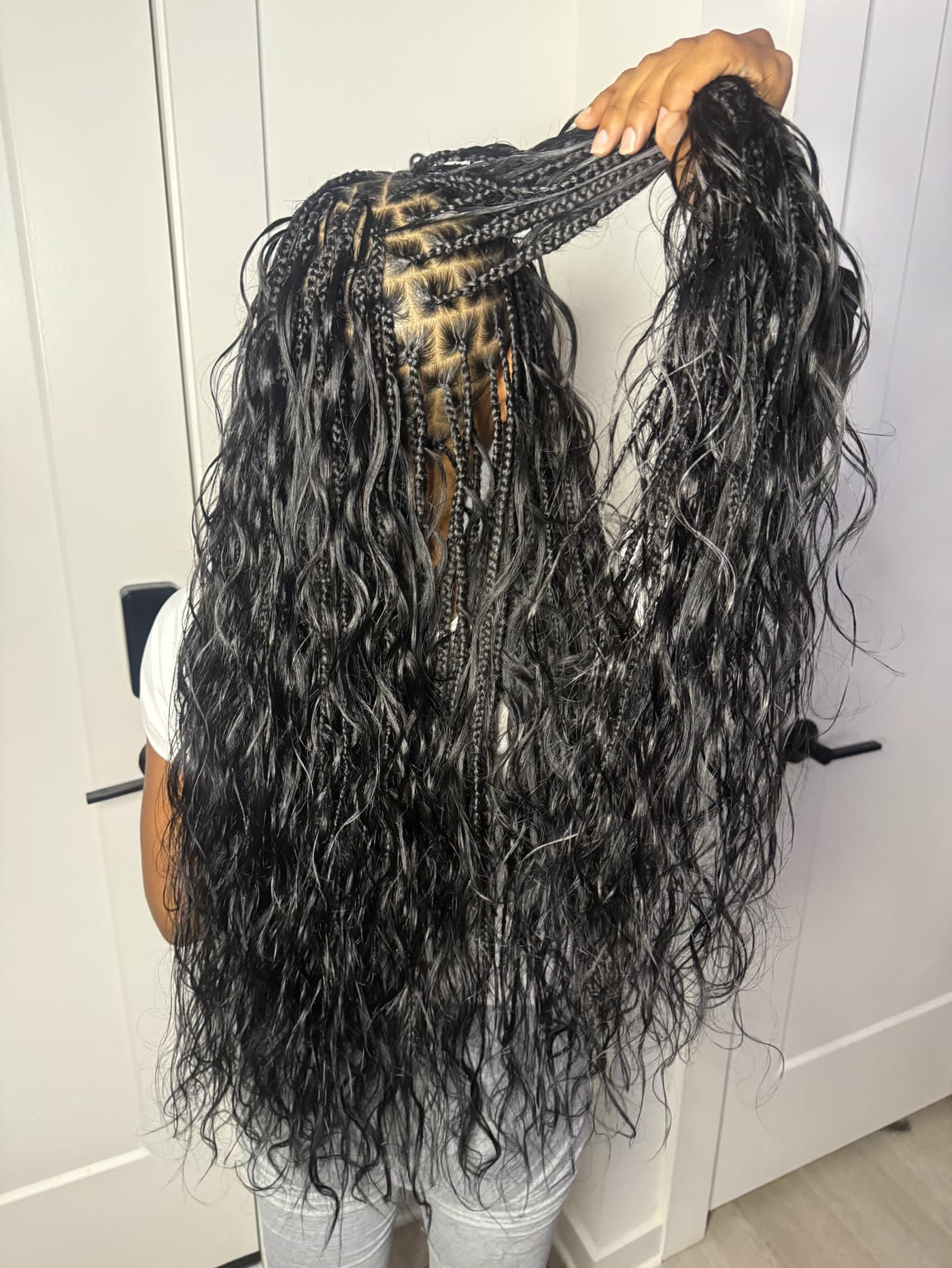
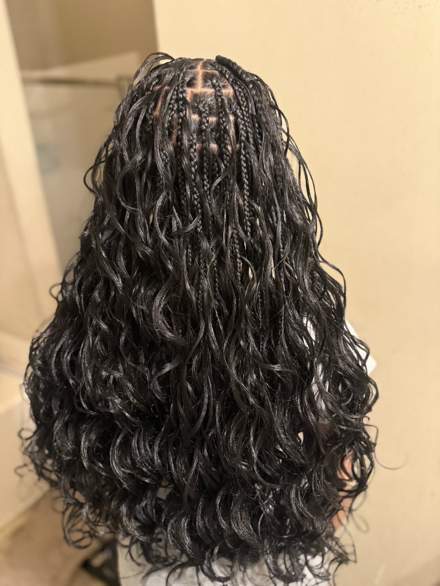
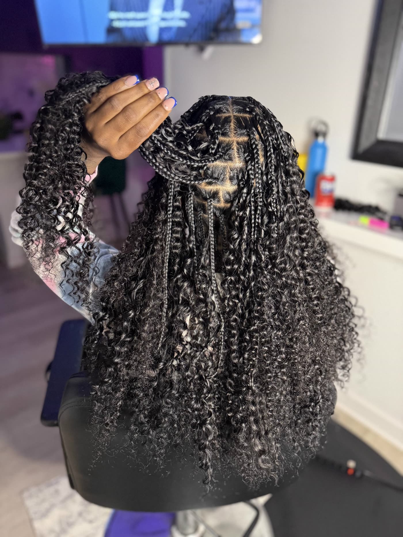
Depends on the style, the size and the length. Men's braids run about 2 hours and feed-ins about 3; most knotless installs are 4 to 8, and small braids down to your butt are the longest day. Boho curls add about an hour for light or regular, and two or more for extra full. Build your style above and it'll show you the estimate for exactly what you picked. We take breaks — you're not stuck in the chair.
How much does it cost?
Starting prices are on every style above. What moves the final number is length, braid size (smaller takes longer), how much hair you want, and any color. Text me a photo of the look you want and I'll quote you before you book — no surprises when you're done.
Do you braid kids?
Yes, ages 5 and up. For kids 5 to 10, pick "Don't see your style?" in the builder and send me a request — I set those appointments up with you directly. A parent or guardian doesn't have to stay for the whole appointment. I'm patient with the little ones, we take real breaks, and I don't fight anybody's head. Color accents are always a hit.
Does my hair need to be a certain length?
3 inches of hair, all around, is required for every style — that's what it takes to braid safely and have it hold. If you're not sure, send me a photo of your hair pulled straight and I'll tell you straight up.
Will it be too tight?
No. Tight is not the same as neat, and tension is how edges get lost. I braid to last without pulling your hairline — and if anything feels off while I'm working, say something right then and I'll adjust it. You should be able to smile when you leave.
How long will my braids last?
It depends on upkeep. Individual braids, twists and locs typically last 5 to 7 weeks; feed-in braids 4 to 6. I'll walk you through maintenance at your appointment, once I've seen your hair against the style you picked. Wrap your hair at night, keep your scalp moisturized, and please don't keep any protective style in longer than 8 weeks — that's when you start risking breakage at the roots.
Do you do takedowns or touch-ups?
No — I only do fresh installs. Please come with your old style already taken down and your hair washed, blow-dried straight and detangled. If you're worried about getting it all out in time, text me before the day rather than on it.
Do you travel, or is it studio only?
Both. Come to my private studio in South End, or I'll come to you — a mobile appointment adds a $40 travel fee to the price of your style. Pick "I come to you" in the builder and it's in your total.
How do I pay, and when?
The $25 deposit is paid by card when you book. The rest is due when we're done — I take Cash App, Apple Pay, or a card in person.
What if my question isn't here?
Just text me. Seriously — a photo of the style you want and roughly when you're free, and I'll take it from there.